Brief Conclusion

As a brief conclusion to the year as a whole in respect of my own personal development I do feel that I have progressed in all the creative and academic areas. From the practical skills learnt in the workshops to the theory in critical dialogues I do have a broader knowledge and understanding of contemporary art.

My practical skill set has widened to include wood and metal work, plaster, screen printing and film although I have not used these areas much they will feature more next term. I definitely would have benefitted more from lessons and some instruction on painting and associated technics and maybe drawing workshops as this is where my interests lay, however, I do appreciate the endless hours spent by tutors trying to get everything turned into a performance or film piece, this was helpful and instructive in making me realise I don’t like performance or film pieces, but such suggestions are quite humorous for which I am thankful.

The film workshops were a particular challenge due to the technical requirements and my lack of understanding about IT and although completed it was not an enjoyable experience. One area I enjoyed more than expected was the essay assignment in critical dialogues, again how successful this was is yet to be seen but my understanding of the subject and research skills improved immensely.


Utopia

A Two week project to create a utopian image which evolves from a 3 dimensional Marquette made from off cuts and found images to a 2 dimensional oil on canvas painting and constructed in the style of artist Dexter Dalwood using his process of collage inspired works. The piece should have mixed perspectives that clash and are disjointed so may end up as a more dystopian feel.

The found images were found from news papers and magazines. Some images had more significance than others. An image of a Lyn Chadwick sculpture, an ancient ruin and a Thomas Moore wood cut. These images were placed in a small box acting as a stage set and could be adjusted and moved accordingly.

Once the Marquette was complete a 36×24 canvas was used to recreate the image, however we were advised to not simple paint what we saw but to explore it further and let the painting evolve past the model. As an ‘experienced’ painter I relished this part and included additional perspective lines, mountains, terraced houses and intense vertical lines with a monolith in the left foreground which dominates. As per the brief conflicting  perspectives are everywhere. The end result is interesting and as an experiment it was a journey but as a successful painting in mot sure.

Pastel

In order to expand my basic knowledge of making fast sketches I spent some time mark making with pastels. I have used these many times before but usually in a nonrepresentational form, today I wanted to alter this. I made a couple of A4 sized hand sketches followed by a still life of objects at home. As in the last few projects I wanted to work in a monochrome format and the results are quite pleasing. The intention with the still life was to make it stylised but still obvious and also to work on the use of a thick line. The finished sketch does have a mid century feel about it almost in a cartoon/animation way. This was unexpected but pleasing.

Reflections on ‘Interview a Professional’

I enjoyed the presentation to the group, possibly because I was comfortable with the topic and my own thoughts on it but also because I felt the information would be helpful to others, the questions I asked were ones I knew other people had previously asked. The feed back was positive, the group as a whole liked the work by my chosen artist Andrew Curtis, but I got the feeling that abstraction may not be to all of their tastes. I could have improved the presentation but slightly misunderstood the brief as I thought I was doing a power point so had to print off many cheap A4 images of the work. This was my error.

IMG_0842 (Edited)

The second part of the process was to take notes an a fellow students presentation. Harry interviewed a self taught sculptor he knew called Michael Barter who’s practice revolved around using discarded waste material found in skips, building sites or the beach. He then sold this work through his website http://www.bartswork.co.uk Michael Barter also ran art workshops for school groups and young adults at a local museum. The works were either a combination of materials making an assemblage or intricate carvings in breeze blocks or house bricks. Many of the works were of a naïve style but others were very classical or with mythological themes. As an environmentalist Michael was keen to reduce the wastage society discards and to try and educate people into sustainability.

The third task was to revisit three other students presentations, I chose Rupps who interviewed Danny Rolph, Loren who interviewed Susan Merrick and Ellie who interviewed Sam Westbury.

Rupp’s presentation was well put together with a strong visual element which was individual and captured some of the movement of Danny Rolphs paintings. She gained good knowledge of his work ethic and routine and I felt it had a professional finish.

Loren’s presentation was very informed and precise with much in depth knowledge but was very light on imagery with only 1 picture which was off the artist with a few works in the background.

Ellie’s presentation was again very detailed and precise with a quite extensive knowledge her artist. It was just done on a laptop so was hard to see the text or images well from the back of the group.

The summary of the whole exercise was positive, I gained good knowledge from my own research and interview and definitely learnt from the peer group interviews.

Three things I would improve my own work with would be a better final presentation, interviewing a completely new artist rather than one I already knew and choosing a different discipline ie not a painter.


Interview a Professional

We were to undertake an interview of a professional within the field of contemporary practice to assess the role of developing a sustained engagement with discipline and ideas.

I chose Andrew Curtis,  A professional artist and abstract painter, an alumni of the Ruskin School of art, Oxford. http://www.andrewcurtis.com I selected Andrew due to an interest in his work and practice and from knowing him from my previous role as a gallery owner where he was represented.

I asked Andrew four questions as follows:

  1. What is your definition of abstraction? – Abstraction is like getting underneath the skin of an object or scene, like getting under the skin. Similar to music, music in a film, the film is representational and the images are familiar but the music underlies the feeling and emotion of the work and can give it a sense of place. Abstract painting can also be seen in this way, you don’t have to depict a landscape to be able to feel it.
  2. Can abstraction be representational? – That depends on whether you are trying to represent a real object or place in an abstract style or working with pure form or movement. Is the painting supposed to look representational? what were you trying to achieve.
  3. How do you decide when an abstract painting is resolved or finished? – If it feels finished, its nothing to do with adding an extra piece of detail, an abstract painting is a feeling or movement, it is finished when you are finished with the feeling or the movement. If you are dithering around and trying to think what to add next you have probably gone to far.
  4. What role does the artist have in society? – Artists are very important to society, possibly not the type who paint pretty picture for decoration but artists can inform the viewer of what was important to that artist at that particular time whether it be political, social, cultural or just highlighting an issue. Artists are not usually responding to an instant social media or newspaper scandal or topic, that will change almost immediately, their practice usually takes more time and is certainly more considered and arguable more valuable in time.

I was very impressed with the responses and felt it did enlighten my thinking of not what to paint but how to paint, the feeling and the movement is all important not the fiddly detail.


Evolving

Keeping with the theme of texture and found materials and continuing to use some of the materials from the last few projects I created Two new works. The first was an off cut of primed canvas approx. 24cm square this then had 2 smaller off cuts glued on, one square and 1 rectangular, the glue was left to dry over night and in the morning it was solid but with one corner rolled over. due to the solidity of the canvas I could not bend it back but actually I liked the result and went with it. Adding a small amount of gold leaf behind the canvas sections created a small area of interest. Then over laying several coats of white emulsion then grey built up a nice texture and depth of colour similar to previous works and that of Franz Kline. The final layer of paint was applied with a palette knife in oil with an impasto finish with a section of grey left revelled. The canvas segments with coloured in a thin black acrylic was and a deep crimson to add just a hint of colour and warmth, similar to works by Robert Ryman.

I do feel the end result works well, I like the rigid canvas and the heavy texture but also the curled edges and faded colour. The way it is nailed to the wall almost like a poster that’s been there to long something that was once shinny and new now discarded and worn.


The second piece also involved found items, this time I had some off cuts of wood and a small 30x30xm canvas board. The wooded blocks were glued on to the board as if in a falling motion but then having been blocked by the edges of the board, stuck in the corner. An off cut of canvas was then glued again as if falling in the centre of the board but it to was caught or stuck but this time by the paint not the edges of the board. I had the corner of the canvas rolled over as before as I like the movement and area this creates. I repeated the layering of white and grey paint to give a texture but deliberately used different paint mediums and glue to make the surface crack and peel, this is very satisfying. Once it was all dry I continued the colour palette from the previous works by using a pure white and black with the crimson. The panels were painted very smooth with sharp edges and look rather neat and tidy adjacent to the rough and cracked surface of the board and canvas.

IMG_0827IMG_0814


Self Initiated Part 3

Following on from the previous posts I wanted to extend the project one step further and to take the materials in a slightly different direction. Using the kiln brick as a base I collected some found materials from around the studio and started to assemble a 3d piece.

The original idea of the homeless person was carried through leaving the drawing on the brick as it was but introducing a new clear kiln brick together with off cuts of wood, PVA glue and gold leaf. The general theme was to have the painted brick on one side of the work and a distinct separation line with the bulk of the other materials on the opposing side of the divide. This hopefully represents the class and wealth divide in most cities. The hustle and bustle, wealth and chaos on the left of the work and the stark grit on the right with a very small amount of gold leaf seeping under the divide.

I think this piece works well either alone or included with the previous pieces. I did receive favourable critique from my peers.


Self Initiated Project Part 2

The second part of this self initiated project is in response to the first part. The figurative paintings and drawings done previously were not all together successful and I felt that without actual tuition in how to improve my observational skills to make a figurative painting look like a human rather than a prop from a horror film I should maybe redirect my energy into a looser more abstract form. I’m not a stranger to expressing myself through abstraction and do feel at ease with it, this may be in part due to the fact there is not a specific right or wrong when trying to depict something that does not have a recognisable or distinct representational form, portraiture is probably not or is ever going to be my forte.

I have been looking at abstract expressionism for some time and adore the work of Franz Kline as well as other, Kline was going to be one of the artists covered in my essay but he didn’t seem to fit squarely into any of the required categories being covered which I kind of like, who wants to be a conformist anyway?

My Starting point surrounded this idea of non conformist attitudes and how that could make one feel isolated or rejected, which is an interesting theory in itself, if one feels reject for being ‘outside ‘a group or section of society does that imply that one feels the need to be included in it? If one was not concerned with such thoughts then the feeling of rejection or exclusion would not exist. Either way the idea of not being in the norm of society and being able to exercise your freedom of expression in which ever way you choose was rather appealing.

I chose a black and white photograph of an elderly homeless man in Toronto Canada, I love the composition of the image, the stark contrast in shades and the very angular properties of the line. Heavy vertical and horizontal lines, a feeling of perspective subdued by the softer rounded lines of the figure and his belongings. I felt it was a very powerful image. One of the issues the individual maybe feeling is that of being dehumanised by society and although he is a real person with real wants and fears he has almost become an object himself, to be walked past and ignored. An object with a shape and a form, a form that can be simplified and diluted into pure form and indeed just a shape. This shape could be described in a tonal effect like a silhouette. Silhouettes however are usually flat and 2 dimensional, maybe I could give it a little character with texture and a looseness, a fleeting moment of paint or mark making, giving the motionless figure in a still photograph a small amount of movement or freedom?

I didn’t want to use a traditional canvas for this work and found a discarded fire brick on campus which was reminiscent of the colour and texture of the materials in the photograph, cold and angular. I used this to sketch a preliminary design which was then painted in acrylic. Moving up in scale I found 3 sections of panel, 2 approximately 100cmx50cm and the other 120cmx75cm. which again helped the narrative by using discarded and unwanted materials. Using Franz Kline as an inspiration and to adopt his philosophy of using everyday materials and rejecting the snobbery of expensive art materials and paint I chose to use house hold emulsion paint and a big brush. The basic idea was to paint in varying layers to build up some texture and also to overlay the colour to allow for the sense of movement and fleetingness, white over black then paint the black over the white to evoke an almost ghostly image. The larger board was to capture the whole image in loose shapes high lighted in the final stage with the addition of a small amount of gold leaf applied to the right hand diagonal line and some smaller flakes mixed into the paint and PVA which was used to thicken the paint. The smaller boards were magnifications of different elements within the larger image therefore the abstraction away from the photograph was complete. The gold leaf takes it emphasis from various cultures, in Chinese and eastern cultures gold was used to repair pottery or objects that were to precious to disregard, the gold was highlighted as part of the objects life and journey, giving it a character of its own. Secondly the idea that many homeless people migrate to big cities with possibly the dream or belief of finding happiness or wealth, the streets maybe paved with gold?

I’m unsure of how this project will be received or understood when critiqued but hopefully it can’t be any worse than the previous one, lets wait and see.


Self Initiated Project Stage 1

Coming off the back of the last few directed projects we were assigned the task of starting a self initiated project over the course of a Two week period which would culminate in a combined year group crit Show.

The new project could be conducted as a stand alone piece of work or continue after the crit show and evaluation into stages Two or Three.

My initial interest came through the idea of facial expression and how fundamental it is to how we perceive and interact with one another. I was especially drawn to expressions that are not exuberant or over dramatic but focused more on the calm and serine. Expressions which are more commonly used for contentment and being at ease with oneself. Examples of such facial features can often be found in religious art, for example depictions of Christ or the Madonna, these always have a look of serenity, calm, forgiveness and piety, the same can be said for depictions of all the leading religious figureheads. I wanted to avoid making images of specific icons or making direct references to a specific faith, more over our recognition of such deities is subject to ones own personal beliefs and cultural upbringings, generally speaking using the conservative western ideas of Christ being a young White male with long Brown hair and beard tend to diminish the essence of the facial expression itself. Is it the face of Christ we recognise or the depiction of the hair, beard and clothing? The same can be said for all religious icons due to the fact we don’t actually know what the individual looked like in reality, most commonly an early medieval or renaissance depiction is taken as fact, again depending on ones own understanding and geographical location.

In many ways a face can not be ‘Expressionless’ because as humans we read a face in all of its complexities and usually with in a context. Are we within a context of a face to face discussion, are we looking at a moving image such as television or film, is it a photograph were we as the viewer accept the image to be true and accurate or are we looking at an artistic representation. The context is key to understand the facial features but if we take the context away how do we then read the expression? I find this interesting.

Obviously as a visual artist and primarily a painter the context is seen as a depiction and artistic licence is usually accepted, the faces I depict are not necessarily to be recognised or accepted as a true likeness, they are just faces and that’s ok. A few contemporary artists who work in this way include Tanaya Sims, Mark Demsteader, Sam Kim and Davide Cambria. Historically nearly all portrait painters start with the face and then build a context into the composition.

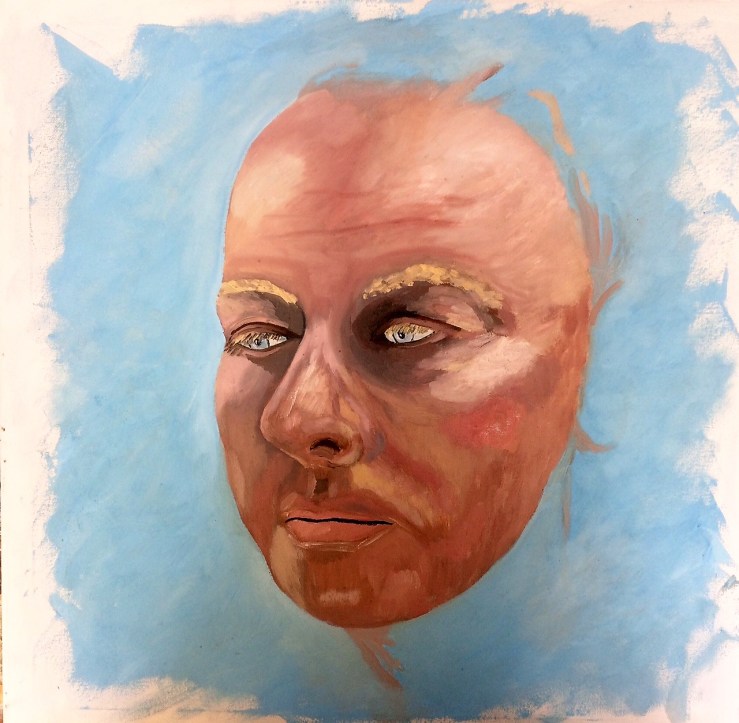
I started my project by doing some small pastel sketches of people around the studio followed by a larger oil sketch of a face on a blue ground. This face was devoid of hair and indeed a whole head, it was just the face with a slightly down turned gaze and without context.

fullsizerenderimg_0619

CRIT

I didn’t receive an individual critique for this work however at the end of the exhibition week I did receive a tutor led group critique which was rather harsh but probably accurate. The general feeling was the work looked to unfinished and a little creepy. The flesh tones were not very realistic with the whole painting looking flat and didn’t really work also it did not communicate any specific feeling or emotion to the viewer which left some asking, why? The work would have been better used as an initial study rather than an exhibited work. Unfortunately there were no real suggestions on how to take the work further other than maybe to use other materials such as latex instead of paint? So as a critique it was quite hard to take solace or encouragement from or find motivation to improve.

I do like to paint and appreciate I have very limited ability but I am eager to improve and better myself, maybe being taught, instructed or tutored in painting and its technics or shown how to arrange a composition or use the materials in a more professional way would help and seems the most obvious solution but unfortunately this is not part of the curriculum.