Small Project

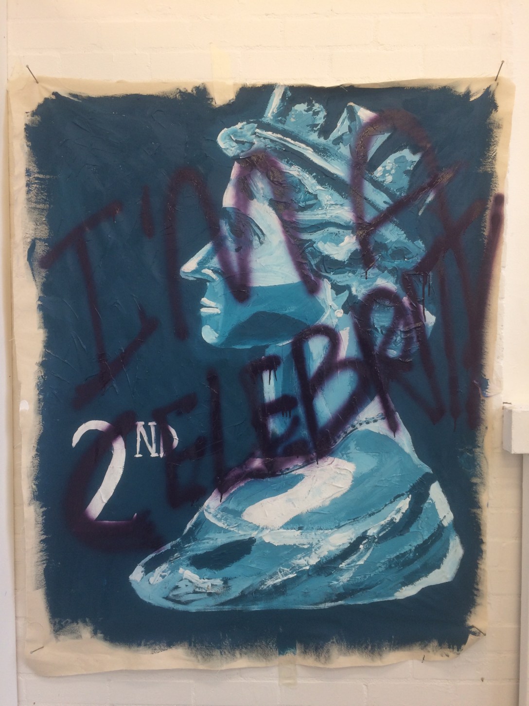
The small project is a construction/sculptural installation that will evolve and move out of our own studio space and interact with our peers work.

The exercise to make a sculptural piece extending out and interconnecting with other work in a manor similar to a Rhizome. The materials will be of a found nature and hopefully will include use of the craft workshops in one way or another. Once the sculpture had been made and extended and reconnected to others we were to conduct drawings and mark making exercises to explore the feeling of the unified work, not necessarily what it looked like as a whole in a representational form but more of an extension of the specific materials from one part of the whole work or to extend the work in a metaphorical sense, where would it take us if we explored this part further or if it were to continue in different material. Also the drawings and mark making could explore the negative spaces or those left unoccupied.

My starting point was my old discarded 7ft  natural Christmas tree which had been in the garden for several weeks. Although it was brown and bare of needles it was still intact as a tree. I first stripped off all the branches and put to one side then cut the trunk in half with a 45 degree angle and attached both pieces either side of a partition wall in my studio space giving the impression the tree and ‘Speared’ or penetrated the wall. This was then screwed securely to the wall, Two lengths of wool were used to help support the wood but also to help it intergrate with the adjacent works which included the same colour wool. On the side of the wall with the bottom part of the tree I attached some of the cut off branches to give the effect of the branches being stripped off as the tree passed through the wall. Adding small pieces of found coloured cloth and rag together with other found materials including glass and metal gave the additional effect of debris and detritus.

This finished work then led to the drawing aspect of the program. On an adjacent wall I stared with making large marks with charcoal and pastels with a variety of lines in all directions but with a general perspective of heading to the top right corner. adding to the line I attached a paper bag, a banana skin various pieces of paper and wood. This then grew with the addition of long thin strips of wood having the effect of elongating the whole drawing.

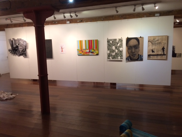
From here I make a series of small A5 size pastel drawings of my own work but also from various points in the studio making a study of other students work, I found these to be the most successful.


Utopia – Work in Progress

For our oil painting workshop based around the theme of Utopia we were asked to critique a fellow students unfinished painting using Feldmans Art Criticism technic. I was charged with looking at and discussing the attached piece.

The painting was on a stretched canvas approximately 36x24cm. The ground was a thin rubbed wash of mixed yellows and pale oranges, the painting then had clear and distinct areas of interest. to the left hand side the artist had painted a loose continuous line with a flat brush in a subtle pinkish red ribbon effect travelling vertically over two thirds of the canvas, the top not quite reaching the canvas edge with the bottom of the ribbon terminating onto a thicker blue overlay, possibly representing a sky, this in turn was above a green area representing a line of trees blowing in the wind. Situated at the union of the ribbon base and the sky effect was the outline of a grey cat sitting with pricked up ears and a wide smile, Cheshire Cat in pose. These features almost covered the left hand side of the canvas with a distinct separation from the opposing side. The Right hand side was dominated by a large grey wave effect showing a rough rude sea lapping at the base of a gothic fascard possibly that of a church. There was little to out line the building apart from a couple of linear features not on the vertical but were clearly aspects of the walls. Three gothic arched windows sat above the crest of a gothic arch doorway. Towards the centre of the canvas a darker brown tall slender window loomed unglazed again repeating the gothic arch but seemed unattached and separate to the other building. The main central section of the canvas was positioned a mysterious grey rectangular block of washed paint on a 45 degree angle at odds with the other elements, unsure of what this represented I assume it is still in progress. All the other aspects of the piece are either directly representational or can be explained in a landscape context and once completed the unfinished parts will no doubt be self explanatory.

The overall feeling the painting gave me was mixed, the ground colour and image of a cat seemed to be from a happy place or from some sentimental memories of times past but the rough swirling sea and austere building set at an eiry angle with its features not dissimilar to a monsters face seemed at odds with the rest of the composition, as the work was set in two very different sections possibly this was deliberate? with the left a happier place or time and the right a more frightening or troubled time with the grey area crossing the border between the two. A very good and effective start to this piece and look forward to seeing it again on completion.


img_0516
Elizabeth Davies (work in Process)


Christmas 2016

As part of our course work a small Christmas project was set, to make something in a new and different way, something that would not need any specific art materials and would not need studio time. Hmmm….

Like most students being creative during the holidays seemed as exciting as another Christmas dinner or watching another black and white film on television, the boredom of yet more furniture and sofa sale adverts, Dull. I was almost harassed in to the idea of the ubiquitous post Christmas sale banners and adverts, so, with this in mind I made an Andy Warhol / Isa Genzken inspired piece.

The general idea is to take left over packaging, ie a soup can and a couple of dozen sale labels and change the cans identity. Although instantly recognisable as a food can it ceases to be a container of a consumable and becomes a banner, but a banner selling what? nothing, an empty expression of sale having the labelling, contents, nutritional values, ingredients, bar codes, country of origin and price eliminated, it doesn’t describe or explain anything. The bottom of the can both inside and out also have the sale banner which would not normally be the case becoming a parody of itself. No longer useful as a container nor informative to a potential buyer, having no monetary value, discarded by the retailer and the consumer and certainly not now loved or missed.


Tate Modern Visit

Prior to our Blain Southern gallery trip I entered the hallowed doors of Tate Modern’s Turbine Hall and was instantly overwhelmed with sound and a vibration from the Philippe Parreno sound installation ‘Anywhen’. This was a totally immersive experience challenging your perception of time and space with acoustics, lighting, flying objects and film.

Up to the second floor and into ‘The Studio’. Only having a limited time at the gallery I tried to see as much as possible but was stopped in my tracks on more than one occasion from the Antony Gormley ‘Untitled for Francis’ to the Mark Rothko room. Each and every piece was stunning and inspiring but in different ways. The Rothko’s because of their scale and singularity, looking simple but with a depth of feeling that they left you speechless, the ground braking works by Mondrian and delicacy of Degas ‘Little Dancer’. One of the pieces which inspired one of my own works was Gerhard Richter’s ‘John Cage Paintings’, the heavy and thick layered paint, peeling and rough, scraped on and rubbed off was very exciting to experience.

My very short visit came to a sudden end and it was time to depart but I will absolutely revisit and would love to explore the rest of the Tate as well.

iphone-094
Gerhard Richter ‘John Cage Painting’


iphone-081
Antony Gormley


London Exhibition 2016

The UCA first year students were asked to exhibit in London during December 2016.The chosen exhibition space was the Menier Gallery in Southwark Street London SE1, we were to be using the lower ground floor gallery space.

The title of the show was ‘In to the Dark’. This title was trying to explore the process of the students coming out of their safe white studio space into the public art scene for the first time and also had links to the current political and cultural uncertainty surrounding us all.

I took inspiration from visiting Tate Modern and various commercial galleries in the days prior to starting my piece, I especially like Gerhard Richter’s work and the Jon Cage paintings.

I started experimenting with texture and thick impasto style paint but given the short lead time I was unable to do multiple layers of paint as Richter would do allowing one to dry before adding further. I found using PVA glue mixed with French chalk or sand would give a very thick fast drying textured based to paint upon. This is how I started my work. The idea behind my painting was the refugee and migrant crisis we are experiencing at this time. I wanted to show this in an abstract way.

The painting is formed of vertical and horizontal lines of varying thickness and colour together with differing textures. The vertical lines represent the streams of migrants fleeing their homelands, different ages, creeds, religions and races coming in such large quantities they were having to be labelled and numbered by authorities almost like a retailer would do with a large quantity of goods, like a bar code for catagorising for an inventory. The vertical lines meet the horizontal and try to mix but like oil placed into water they can not and just separate and merge with themselves in pools or camps, included but segregated.

The mixed media materials also fighting against each other with some paints cracking and splitting with differing drying times and elements, Oil, acrylic, glue chalk etc all reacting with one another. The dark base colour barely visible but still seen through the cracks could describe the under current of feeling from the authorities and governments, some smooth and accepting others hard, thick and uncompromising. The primary colours representing the primary need of the people displaced to protect themselves and their families, primal instincts to seek safety and shelter. Painted in a landscape format depicting the current landscape and divide in Europe and the middle east.

The final work is a mixed media canvas painting, 92x61cm in size.

displacement

menier-gallery

Image Material Surface

This project is to recreate, manipulate or interpret an image in Four different ways.

I chose the image of Queen Elizabeth as depicted on the British 2nd class stamp. I specifically chose an older style image of Queen dating to approximately the 1980’s as I preferred it over the current portrait. I selected this image not because I have any real affinity for it or emotional attachment but because of its utter banality, it has been used for decades on every stamp, coin and bank note and has been reproduced hundreds of millions of times. For this reason was I wanted to alter the image, make it less than perfect or less banal, this would also make a gesture to the defacing of normal stamps and bank notes which would render them worthless.

I started out making a 1/1 scale oil painting of the stamp in question, this was rather tricky due to its size and using the smallest brush I could find. It was relatively successful as it did fool a few people on first inspection. The second was the image above. This is approximately 1.5m x 1m in size and is of mixed media. The underpainting features are heavy impasto made using French chalk mixed with PVA glue and applied in thick lines. Then using house hold emulsion the painting developed in the original colour scheme of the stamp. The final phase was to deface the image in a graffiti style with spray paint. The text ‘I’m A Celebrity’ is not only a play on the television program but also the fact that the Queen is one of the most famous and photographed people on the planet yet not a celebrity in the modern sense of the term in television shows, social media or reality programmes.

The Third image was a more tradition collage piece. An A4 size image of 15 stamps but with each image cut out and repositioned in a different place and slightly offset creating a shadow effect. The image in the top right hand corner where the stamp would traditionally be placed for posting was again misplaced and left blank with the cut out almost discarded at the bottom of the piece, in reality a letter without a stamp would not be valid or delivered thus rendering the stamp and the letter devoid of usefulness.

The final image was more sculptural. A foam manikin head was used to make a dystopian image of the queen. Using the original blue colour the crown was replaced with large nails pushed into her head, her famous pearl necklace was replaced with further nails driven into her neck and shoulders. The pearl earrings were again replaced with nails and she also received Two addition piercings in her upper ear. Two other displacements were in the crown which was now lowered and acted as her dress covering her modesty and her pearl necklace had been elevated to represent her exposed brain. The head cavity was exposed and painted a deep shade of red, additionally the right hand side of her face which would not been seen on the stamp was also hacked away giving the image an undead zombie effect. Slightly disturbing but I feel it did meet the brief.

iphone-058